Creating Maps with Google’s Map Styling Wizard
Getting Started
For this assignment, I chose to develop a map for the National Audubon Society (“Audubon”), a non-profit dedicated to the conservation and study of birds and their habitats. While the organization consists primarily of enthusiastic ornithologists and conservationists, they rely heavily on the participation of the general public – amateur birders and donors both have a role to play in the conservation movement.
The organization does not have a consistent or clear visual style. While the images of regional birds are colorful and draw the eye, the maps included on their website, such as this depiction of their national network, already look a bit out of place and have fairly chaotic coloring. This encouraged me to attempt to style a map based on one of the images they were already sharing on their website.
I took a screenshot of Audobon’s Guide to North American Birds, which features a Cedar Waxwing. The colors were the most vibrant and dynamic of all the bird photos, and I thought it would give me a more flexible palette to play around with.
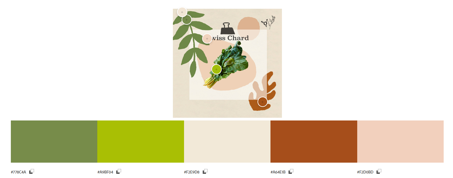
Adobe generated the following palette from the image:

In order to input the colors into the Styling Wizard, the Hex Codes needed to be converted into an RGB format:
Creating the Map
View from a National level:

View from a city level:

In this hypothetical scenario, the map would be used by individuals to plan trips to national or state parks for the purpose of birding. For the background, I utilized the light brown color (#8C7158) and adjusted the opacity to make it a more neutral, grounding color, allowing the golden color (#F2B705) representing parks and other natural land features to pop and draw the eye. The blue color (#276573) when made slightly more transparent made for a sensible choice for water features, providing sufficient contrast to the neutral landscape. The light brown, in a less transparent form, was used to represent major highways, with the bright red color (#BF2C2C) used to represent local roads – local roads can only be seen when the user zooms into the map. The benefit of this palette is that each item is fairly distinct: it is easy to pick apart the roads and natural features from the default landscape. I do regret not using a palette that was more of a gradient – the colors ended up being so distinct that even when adjusting the opacity, saturation, and brightness, they don’t mesh together quite as well as I had hoped. While this was a boon for visibility, it was less useful in creating a map that felt cohesive.
Next Steps
The next step was to make the map more dynamic and interactive! You can find more information on that process, along with the final map, here!
My Initial Failed Attempt
It is worth briefly noting that the Audubon Society was my second non-profit of choice for this assignment – they’re not only well established and well-funded, but also use ArcGIS in their own work. Initially, I had hoped to create something for an organization like the Okra Project, a very small non-profit with scarce funding that seeks to combat food insecurity for individuals who are Black and transgender. However, regardless of the graphics I selected from their website, their color palette was nearly identical to those on the pre-generated, “Retro” style Google Map. A sample of one such palette can be seen below:
The good news is that should this organization ever attempt to create a map, they already have a readily available resource!