Reframing Politico’s Approach to Outlier States
For my critique through redesign, I selected the “Which States Have Vaccinated the Most People?” graph from Politico’s recent article, “9 states getting it right.” While I am a fan of Politico’s written content, I found their representation of these data to be both messy and a bit disingenuous. From a purely aesthetic standpoint, the graph is also hard to read, with too many clashing colors and sharp angles that are wholly unnecessary to just show a general upward trend. Regarding the content, their argument seemed to be that five states (Alaska, West Virginia, North Dakota, New Mexico, and Connecticut) had vaccinated “more people” than what is shown through the national average. This claim is true, but only if you measure the proportion of residents in each state who have received at least one dose of the vaccine; this does not actually tell us the proportion of residents who have gained immunity through their second dose. In addition, despite their visual, the difference was not substantial enough to be compelling for the viewer – there was not a significant departure from the national average. In short, it did not feel like a fair comparison between states.
The data Politico used stems from Bloomberg’s Covid-19 Tracker.
Wireframing
While I thought a map might be best to provide additional context and explore the differences between states, I also sketched out a unit chart and a stacked bar graph.
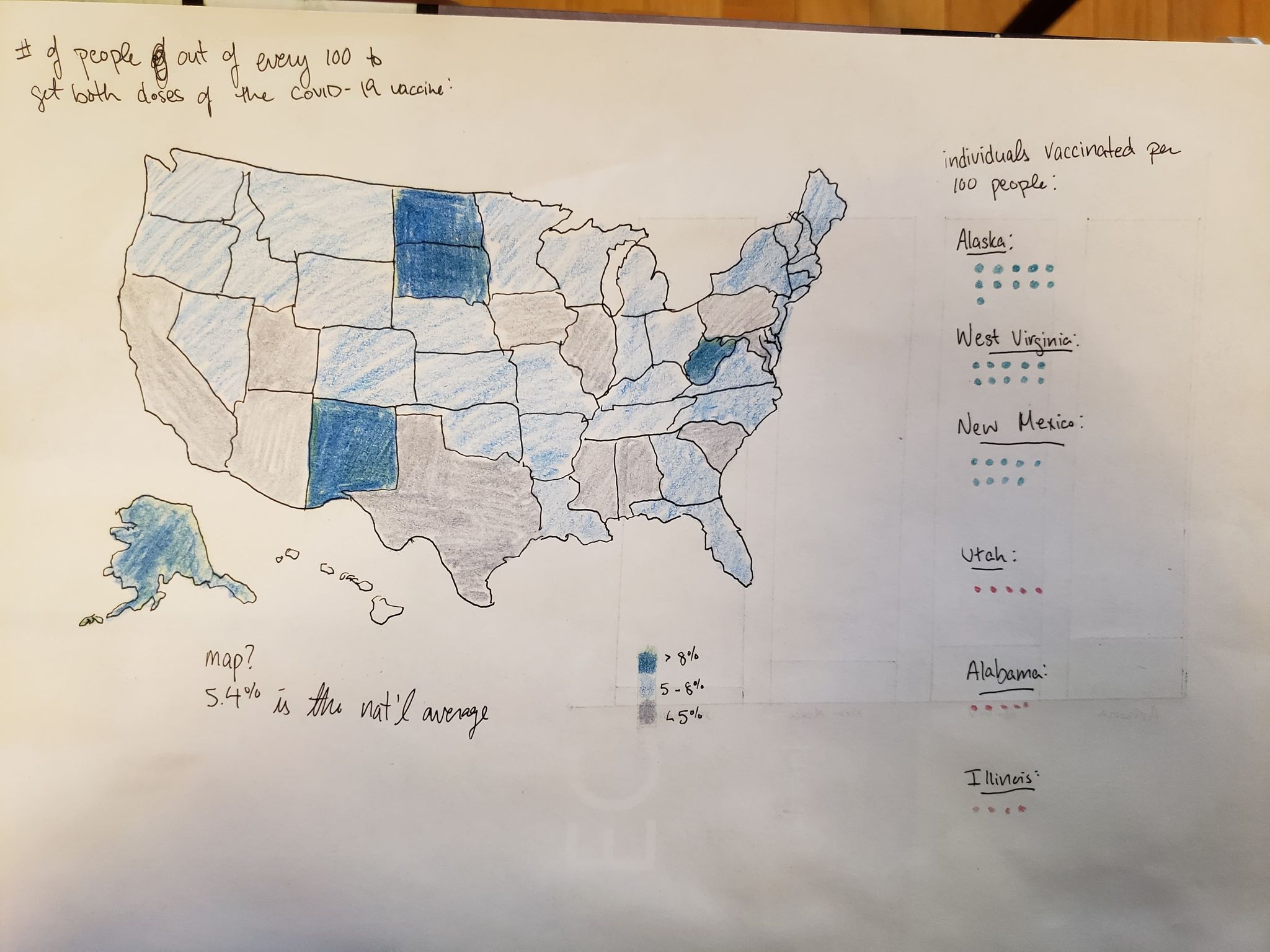
I thought the map would make the argument more visually compelling, allowing readers to draw comparisons between outlier states and states more familiar to them. Simply providing a national average doesn’t say much when there are such wide-ranging values, and I hoped that splitting the colors into three tiers (below the national average, middling, and outliers) would help make these differences more distinct. The way the data is represented (such as the “five out of 100” national average) can be hard to grasp. With the unit chart, I had hoped to emphasize that the measurements we were looking at were representative of individuals living in those states to make the visual more tangible. I also tried to add an additional layer of contrast, representing the top three states in blue and the bottom three states in red, using the same metrics as Politico (proportion of individuals who had received at least one vaccine).
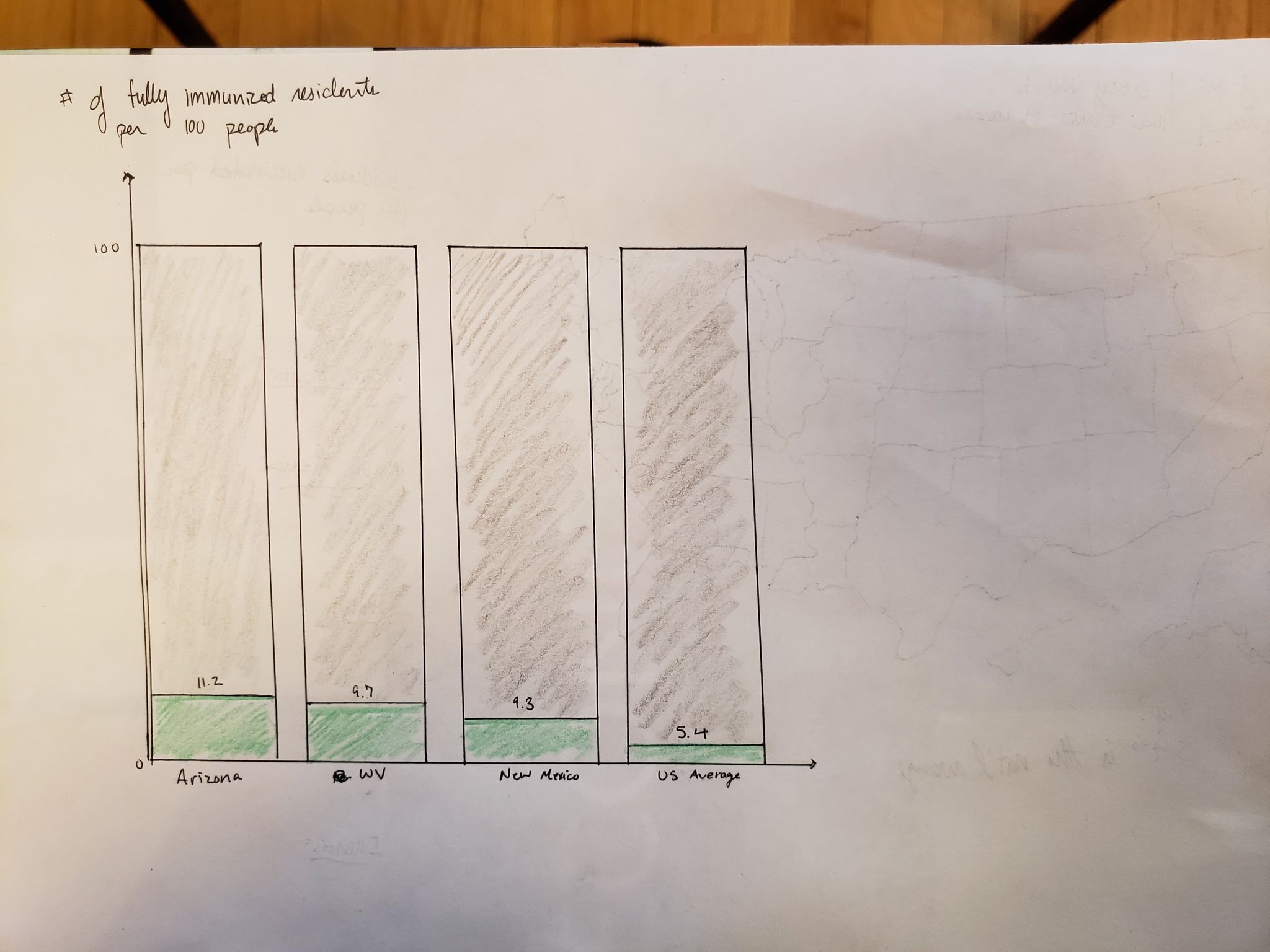
The bar graph was not an excellent idea, but I thought it was worth at least trying out. I was concerned that the data from Bloomberg were exaggerated by Politico, and wanted to try laying them out next to the national average to see if there was truly a difference worth noting. When laid out in this way, I thought there was actually quite a compelling argument that Alaskans were faring much better than the average American, but that much of the comparative detail was lost through this visual. Not every idea is a winner!
Feedback (Or: My Friends are Very Generous with Their Time)
The feedback I received was overwhelmingly in favor of the map, with one dissenter who worried that while it was the most aesthetically appealing conveyed too much information to be worthwhile.
Map Feedback: The common pain point for the map was the use of the grey to indicate a below-average performance for a state – several comments noted that they, “read grey instinctively as ‘no data shown / insufficient data’” and would prefer more of a gradient effect, and a clearer scale, in the final product. One of my participants is also colorblind and noted that he had a very hard time distinguishing between the different shades, encouraging me to make the colors more bold or distinct. The reception was generally positive, but two of my participants pointed out that it didn’t feel like this map was generating a lot of new information. Yes, there were two or three outliers, but overall the map made them feel as though everyone was generally following the same trend. One individual went so far as to say that this indicated these data were flawed, claiming we needed to, “get a more accurate representation of the different levels of immunization per state…because as it stands, it appears like most states are at identical levels” and asked if there was a different way to analyze the information that might make the differences more distinct.
Unit Chart Feedback: Shockingly, despite this idea being one I was fond of, this chart received the coldest reception from my participants. The unit chart gave a sense that things were “significantly better than they are” and that this method, and the data, failed to emphasize the different populations of each state. There were several valid concerns brought up, including: the challenge of including partial dots, the lack of context around these six specific states, and that it would be more challenging to use this information in a practical sense. One idea I really enjoyed was the suggestion that I simply outline a box where 100 participants could go, rather than drawing out 100 gray dots. Regardless, this one was not as clear as I had hoped, and I decided to scrap it.
Bar Chart Feedback: Universally disliked, with the exception of the individual who felt strongly in opposition to the map (who knew my friends were such contrarians?). While this technically represents the same data, people did not feel each bar was distinct enough, and that this representation felt too redundant.
The Final Product
Ultimately, I ended up redesigning Politico’s line chart into more of a heat map, utilizing Bloomberg’s data to make calculations that created greater distinctions between how states were faring. In the original representation, Politico pulled directly from Bloomberg’s data to map out the proportion of individuals who had received at least one Covid vaccine, making it look like states like Alaska and West Virginia were leading the rest of the country in vaccinations. However, what is ultimately more important in this representation is the proportion of residents who achieve immunity. Using Bloomberg’s data, I made a few small calculations so we could instead look at the follow through rate for vaccinations – rather than looking at the proportion of people who received their second shot, I wanted to analyze (1) the difference between that state’s vaccination rate and the national average and (2) the percentage of residents who were actually completing the full vaccination process. This method also allows us to consider the size of the population of each state and take a more even measurement, rather than claiming that states have been exceptional vaccinators when, in reality, they have smaller populations overall. To make the contrast between states more evident, I broke the ranges down by quartile. Looking at the same data through a different lens reveals that while the states outlined by Politico do have a higher proportion of residents who have received at least one vaccine, other states are on equal footing in following up and ensuring immunity for their respective populations. Here, we can see that Alaska, West Virginia, and North and South Dakota are still leaders in the vaccination process, but our attention is also drawn to states like Michigan and Vermont.